 |
| This would be the cover of my autobiography. The spilt milk is centered with the "l" looking like it was poured out of the glass. My name is right aligned to contrast author from title. The title and subtitle are aligned together. |
 |
| This one is a bit difficult to see because the letterhead is white on this white background. I chose a picture of yarn and centered it on the top with the name and slogan of the business right aligned into it and the name of the owner and instructors left aligned. I put the address and phone number of the business in the bottom right hand corner so it's still accessible but doesn't take away from the top. |
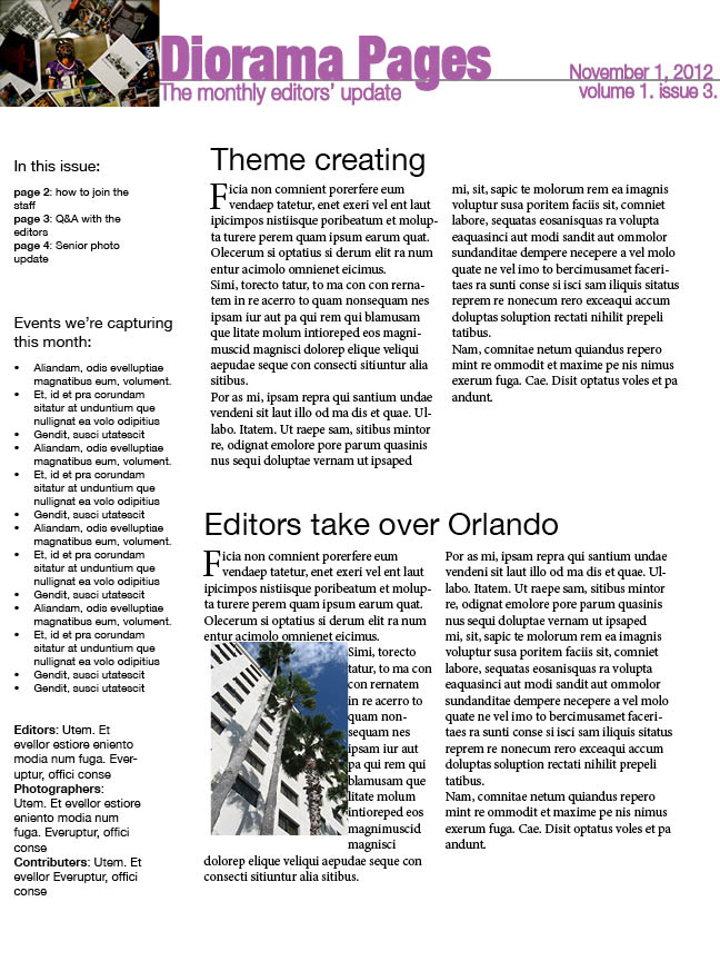 |
| I know the book said not to use Helvetica but I chose it because that is the type of font used throughout the Diorama. The name of the newsletter is left aligned to the picture and is bolder than the rest of the information. The date and issue number are right aligned. I chose to do a sidebar to list the contents, briefs and the staff. For the articles I left aligned and broke them into two columns. I also made the first letter stand out. For the second article I chose to text wrap the picture of a hotel in Orlando. |
 |
| Leonardo and Rachel are classy, simple people so I figured their invitation should match. All the important information is aligned to the right, hitting the white line. The RSVP is more of an afterthought so I chose to separate it and place it left aligned. |
No comments:
Post a Comment