Tuesday, March 6, 2012

Sydney Threet


On the bookmark, I used the same colors that were used in the picture of the close-up disease. I used a font for the title that would grab attention and also flow well with the ADPH logo. I chose a sans serif font for the text on the bookmark because it looked cleaner and easier to read than a serif font.I made the number a bigger font than the text to make it easier to distinguish between different points, and I made the title a bigger font than the text so it would be easy to distinguish between the title and the list. I center aligned the main text, but I right aligned the title. I tried swapping the position of the title and the picture, but I thought the picture grabbed the attention of the reader and then the picture flowed into the title, which would make the reader keep reading after the picture. I used two different shades of blue for the background and words, and though it may be difficult to read from far away, it is a bookmark, so it will be read close up anyway, but it made the text pop against the contrasting background and against the bright green background of the whole page.


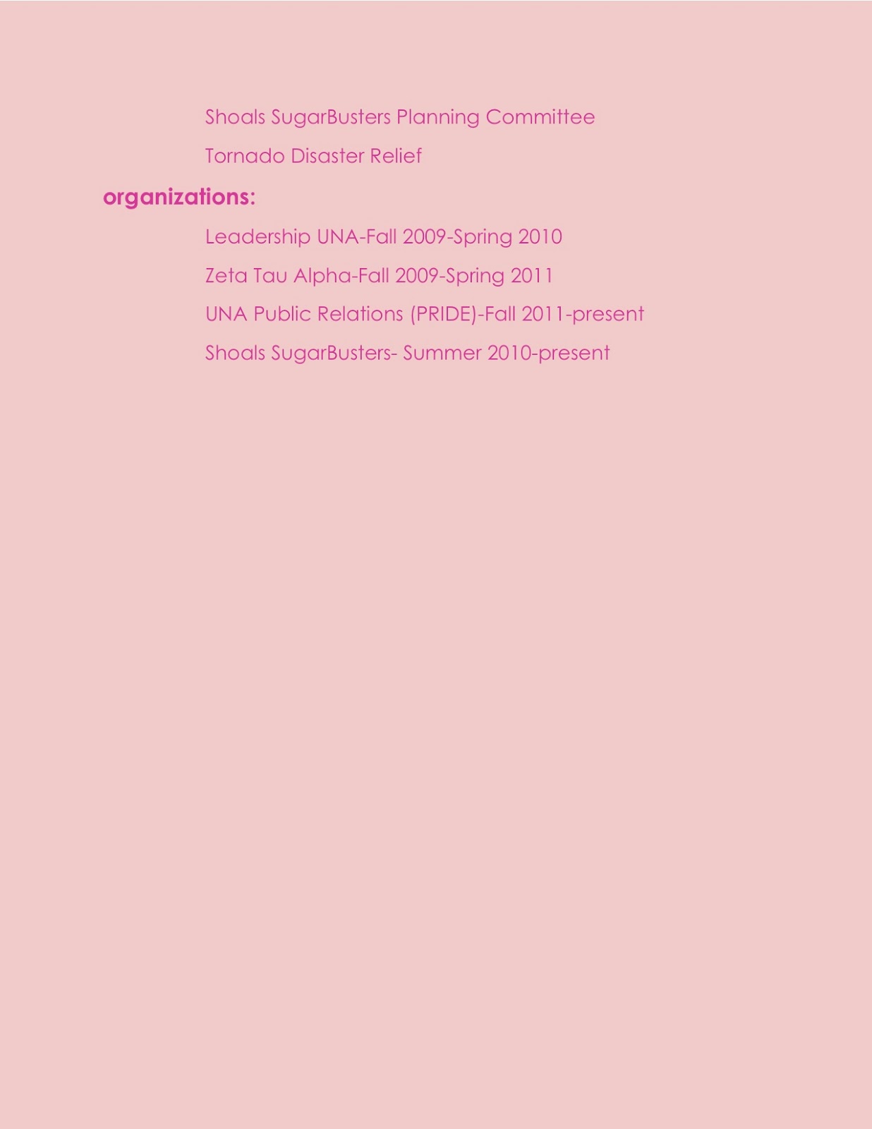
I chose to use a basic format for my resume because I thought it looked the most professional, but I chose a super light pink background to add a slight pop of color but still remain professional.I used the same basic sans serif font throughout, but I distinguished headings, subheads and other text with underlining, bolding and bullets. I left aligned everything except my name and contact information at the top so that everything would flow together, but the contact information would be able to be found easily from any point on the page.

Ashlyn Pounders Contrast-Bookmark

I used the dark blue writing to contrast with the light blue background. The dark blue is also seen in the ADPH logo. I tried to find a font that resembled both for repetition. It is center aligned so it is easy to read.

Ashlyn Pounders Contrast-Resume

I used proximity by putting all of the things in the same category together and i right aligned my information and left all of the other categories. I used repetition by using the same font throughout the entire thing. The dark pink contrasts with the light pink background.

Rachel Witt

I used proximity by filling all the spaces with color to capture attention.  I made sure the boxes aligned and the font matched up. Repetition was used in the style of font and the colors repeated, along with the ADPH logo. Lastly, Contrast- I used this by contrasting colors, I used three that would stand out against one another, I also used different size fonts.

For my resume I used Proximity by spacing everything out, and not leaving any empty spaces.  Each heading aligns, and the spacing.  Repetition was used by continuously using the blue for my headings and the logo, as well with the font style.  The contrasting points were the fact that I used a different color font for my name and heading to make them stand and made the font for my name a lot bigger than anything else.  

BookMark and Resume'

  In my resume'  I used two different colors of purple, the headings are vertical along with different text throughout the document, that I think compliment each other well. I used American typewriter and Monaco  the headings are in 30-36 fonts  ( alternating) and the bulleted items are in 14 fonts.
I had center aligned my name, right aligned my e-mail and left aligned my phone number.
The bookmark, I used the Colors that are Incorporated with the ADPH logo, I decided to use this logo because I thought it was different and cool. The fonts used are Chalkboard & Blackoak Std. I just kept the design simple and and I center-aligned the 10 steps to fight the flu.

Monday, March 5, 2012

Resume and Bookmark Design


For my resume I chose to use a black decorative background and then contrast that with a light blue font and smaller white fonts for the body. I also contrasted the resume by enlarging my name at the top and setting it apart using a dotted line across underneath. I also chose to center align everything to give it a more streamline look. 

For my bookmark I chose to use a light background image with a contrasting color border around the outside. I then used the logo at the bottom in the same color used throughout the bookmark. I enlarged the heading and used a aqua font outlined in black to make it pop. I then center aligned all the information down the bookmark in a smaller black font. 

Resume & Bookmark Paragraph

In my bookmark i used proximity by making sure everything was close and grouped together to reveal a connection.  I used a left alignment for the list because it looked better than a center alignment and because we read left to right and i wanted single lines to make it look short.  i center aligned the ADPH logo and phrase so it could stand out out.  i used repetition through my colors using blue and white in different areas.  i used contrast in using red on my catch phrase and making the doctor picture on half the bookmark.

In my Resume i used proximity by making sure i spaced everything appropriately considering i did not have much information. i used left alignments on my section titles and made sure the information was aligned appropriately in each section.  i used repetition through bolding titles and using a basic color black through out and through different font size. i added contrast by using a picture on the page and centering my name and email.