
Tuesday, January 31, 2012
Assignment 2 Letterhead
Assignment 2 Newsletter

Assignment 2 Autobiography

Assignment 2 birthday

Gehrs,Siobhan assignment 2
 |
| This would be the cover of my autobiography. The spilt milk is centered with the "l" looking like it was poured out of the glass. My name is right aligned to contrast author from title. The title and subtitle are aligned together. |
 |
| This one is a bit difficult to see because the letterhead is white on this white background. I chose a picture of yarn and centered it on the top with the name and slogan of the business right aligned into it and the name of the owner and instructors left aligned. I put the address and phone number of the business in the bottom right hand corner so it's still accessible but doesn't take away from the top. |
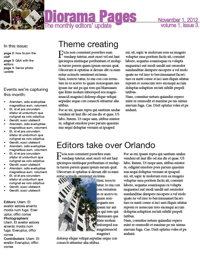 |
| I know the book said not to use Helvetica but I chose it because that is the type of font used throughout the Diorama. The name of the newsletter is left aligned to the picture and is bolder than the rest of the information. The date and issue number are right aligned. I chose to do a sidebar to list the contents, briefs and the staff. For the articles I left aligned and broke them into two columns. I also made the first letter stand out. For the second article I chose to text wrap the picture of a hotel in Orlando. |
 |
| Leonardo and Rachel are classy, simple people so I figured their invitation should match. All the important information is aligned to the right, hitting the white line. The RSVP is more of an afterthought so I chose to separate it and place it left aligned. |
Thursday, January 26, 2012


Wednesday, January 25, 2012
Menu/Grocery List


Grocery List: I had designed different boxes for each category I had tried to put the check box as an option, but I could not figure out how to do it. I used the American Typewriter font, simply because it looks very vintage and if I ever organize a grocery list in the future I would probably use the same design and font I had used on this project.
Tuesday, January 24, 2012


Assignment 1 ht


Menu: I used differing font sizes to note the importance of each thing in the menu:
headings>entres/drinks>description
Grocery List: Since grocery lists are typically simple, i tried to keep it that way, I underlined the aisles that I'd go to for the items and listed them accordingly.
Business card: I used proximity where my name was the largest and most important, then contact info, then catchy quote about the business.
Student media: I centered each day, made the events bold and italicized the sun headings


Business Card

My business card is an example of the format that is used by the Alpha Delta Pi Delegates and Traveling Chapter Consultants. I used the Logo to help one associate my position within the sorority. My name appears in BOLD print because it helps stand it apart from the other contact information.
Subscribe to:
Comments (Atom)